 |
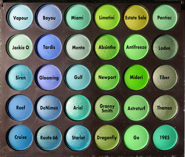
| Crown Brush 180 Palette Panel 3 |
The Tri was really a fun race, the ocean was smooth and the current was with us, the water temperature was a balmy 71 degrees! And on the run, just when it should have been starting to get too hot, a blessedly soft white marine layer of cloud and fog rolled in at either end of Zuma Beach. Such a great day!
And speaking of ocean, this panel has lots of watery blue and green shades. If you haven't checked out my first two posts on this palette, click here to read Panel One, and here to read Panel Two.
So here's what I did starting with Panel Two, and I know once I get through this monster of a palette, I'll want to go back and do it with Panel One, as well: I named all the shades. Yes, it's hard to do that, but it's also a great copy writing exercise, so maybe I should thank Crown, and Inglot, and Wet n' Wild, and others, for not naming their palette shades, instead of whining about the fact that they have no names. I suppose I'd rather whine a bit. I know if I had a cosmetics company, I'd be naming all of my shades to make them memorable. And that's the end of my mini-rant.
So as I go, I'm naming all the shades. It makes it a heck of a lot easier to talk about them. Et voila! Here is the panel with my names!
And here's what they look like swatched on my hand!
 |
| Crown Brush Palette 180 Kaleidescope, Panel 3 |
Here are my favorites:
- Ariel and Siren are so intense and shiny. It's always easier to find highly pigmented shimmery shades, I've noticed, although I don't know the science behind this fact. I'd love to know why matte shades so often take a lot of work to build up intensity. This fact definitely holds true in this palette.
- Loden, Tiber and Thames. See there what I did with the names? I was just in London and Rome, and since these were murkier muted shades, I named two of them after the rivers in those cities. Ain't I clever? (I expect you to throw a pie at me at any moment, and it would be deserved.) Anyways, these 3 shades are the most neutral and wearable for fall. Thames and Tiber have some nice antiquey gold shimmer to them.
- Antifreeze. It would be wrong to wear this crazy bright green with a touch of teal on my eyelids. Really, this is the color of tennis nets, mosquito netting from the seventies, and other tackle you might find on a boat. It's wrong, and that's why I love it. Challenge. Can you rock this shade or something similar without going full-on Little Mermaid or Frank N Furter? Can you? Do it, and link me to the images/video on the comments below!
- Siren, Reef and Cruise - These are so marine blue. They are all shades you find in the Mediterranean, and so they make me happy. Oh, I love me some ocean! This weekend the Pacific at Malibu was 71 degrees, people! For me, that's no wet suit water! Yay! There were dolphins! The curling waves were beautiful but not so large as to be dangerous. No one's there now because it's after Labor Day, so it's easy to park. Go there! It's a heat wave! Swim in the water, it's so nice!
- Bayou, Tardis and Gloaming. Yes, I'm a Dr. Who fan, a Whovian, if you will. If you have Netflix, start watching the modern seasons, starting with the Christopher Eccleston ones. You'll thank me. Yes, it's silly, yes, it's a kid's show, but it also gets you weepy, and it can really scare the pith out of you. Watch, and tell me I'm wrong. I love this show! So that's why one of these colors just had to be Tardis blue to me. I love the delicate violet tones of these blues. I think they would probably look super-pretty on brown eyes. And they will maybe look cray-cray with my light hair and green eyes, but I want to try them anyway.
I hope this post was fun for all of you. Let me know what you think!
Love, BeautyJones!


great post!
ReplyDeleteI just followed your lovely blog and liked this post on Bloglovin. Stay in touch ;)
LA By Diana Live Magazine
Thanks so much for following, Diana! I look forward to more of your looks and great photography and great info on L.A. spots!
DeleteBy the way, do you like Vietnamese places? There are three amazing spots in my neighborhood you might want to check out. Don't know how often you get to Silverlake.
If you do, try:
Xioia (on Sunset, hipster vibe)
Pho Cafe (near Parkman on Sunset, the Pho is amazing!)
Gingergrass (on Glendale near Silver Lake Blvd., more American style, slightly more upscale feel)
Try the Pho or the Banh Mi. So delicious. Each place does them slightly differently.
Cheers! Thanks again!