So I ordered this
smashbox Photo Op Mega Palette from QVC, which is the only place you can get it, and after my iPad, it's my favorite thing. Obsessed! Seriously. I may need to start a 12-step program just for this.
 |
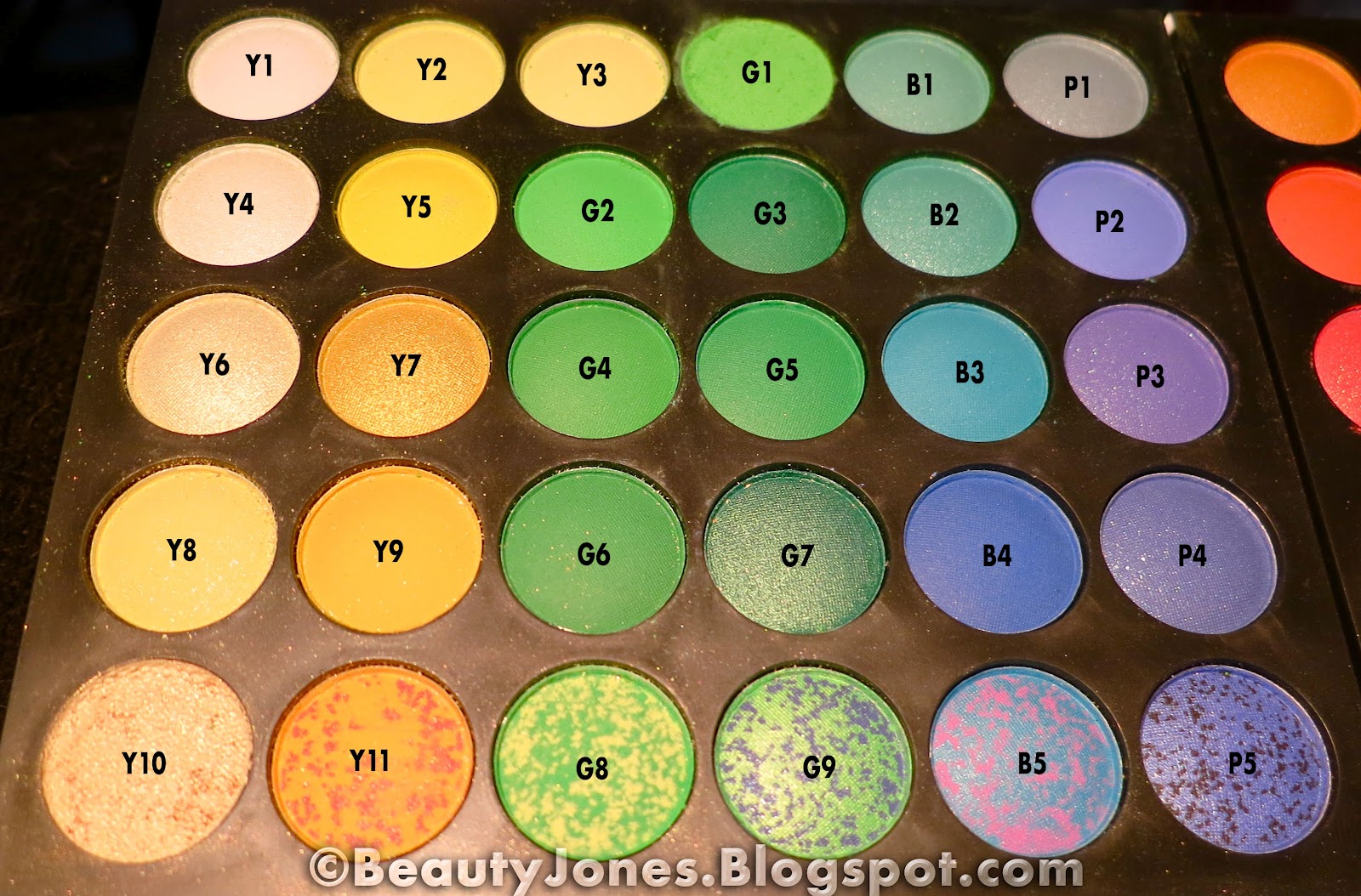
| smashbox Photo Op Mega Palette |
 |
| smashbox Photo Op Mega Palette |
 |
| smashbox Photo Op Mega Palette |
I'm working my way through the Photo Op eye shadow trios. Today's look is Hyperfocal, which is made up of Mist, a blue-gray silver, Rose, a silver-gray shimmery pink, and Obsidian, a deep charcoal gray with pale blue shimmer. Mist went on my lid, browbone and tear duct area. Rose covered the lid. Obsidian went down by the lash line, beneath my eyes in the outer third, and blended up into the crease.
Oh, this stuff is so nice!
The texture of this is fantastic--smooth, buttery, only a touch of fallout, and it blends like a dream. You almost don't have to blend it at all, which really does save time. Pigmented, check. Subtle shades with nice color nuances, yes!
The palette contains all of their Photo Op shadows, a complete suite of eight eye liners, an eyebrow wax and all of the brow shades anyone will ever need, two blushes, four lip glosses, and three highlighters, aka "Soft Lights," all within a sleek red patent leather binding that closes firmly with small magnets.
I used the eye liner in Picasso, a teal-navy blue.
This almost contains all the makeup you need for travel, except for foundation, concealer, mascara, bronzer and finishing powder.
I used it with the small sample of their Photo Finish Lid primer, which works at least as well as the Urban Decay Primer Potion.
The brow powders and wax are now my favorite way to do my brows. The blushes are pretty much all you need. I usually alternate between a bright magenta pink and a terracotta shade anyway. These are lovely. I especially like the magenta one. (See tomorrow's post.)
Lips: OCC Lip Tar in Kava Kava topped with Anastasia Lip Gloss in Bellini. This is my favorite kind of nude lip—one with a touch of peachy orange.
I hope you enjoy taking this journey with my and smashbox. I'm loving it!
Cheers!
What's your favorite eye shadow? Which formula is your favorite? Which colors?
As always, drop your thoughts into a comment below!
:)BeautyJones


 Try it out yourself and see how long your lip color can last! Let me know how it goes, and comment below. Tell me what you used.


